Masterji is an edtech mobile application designed to help school students assess their preparation and improve performance through guided testing and personalized insights.
I worked as a Visual Designer, leading both the UI design and illustration system, ensuring the product feels engaging, friendly, and motivating for young learners—not just functional.

Problem
Most test-prep apps feel:
- Overwhelming and text-heavy
- Emotionally cold and intimidating
- Lacking motivation for consistent usage
Students often associate testing with stress, which reduces engagement and retention.
Objective
- Make test preparation feel approachable and enjoyable
- Simplify complex flows into intuitive interactions
- Build a distinct visual identity through illustrations
- Create a scalable system for future features


Design Approach
Friendly & Gamified Experience
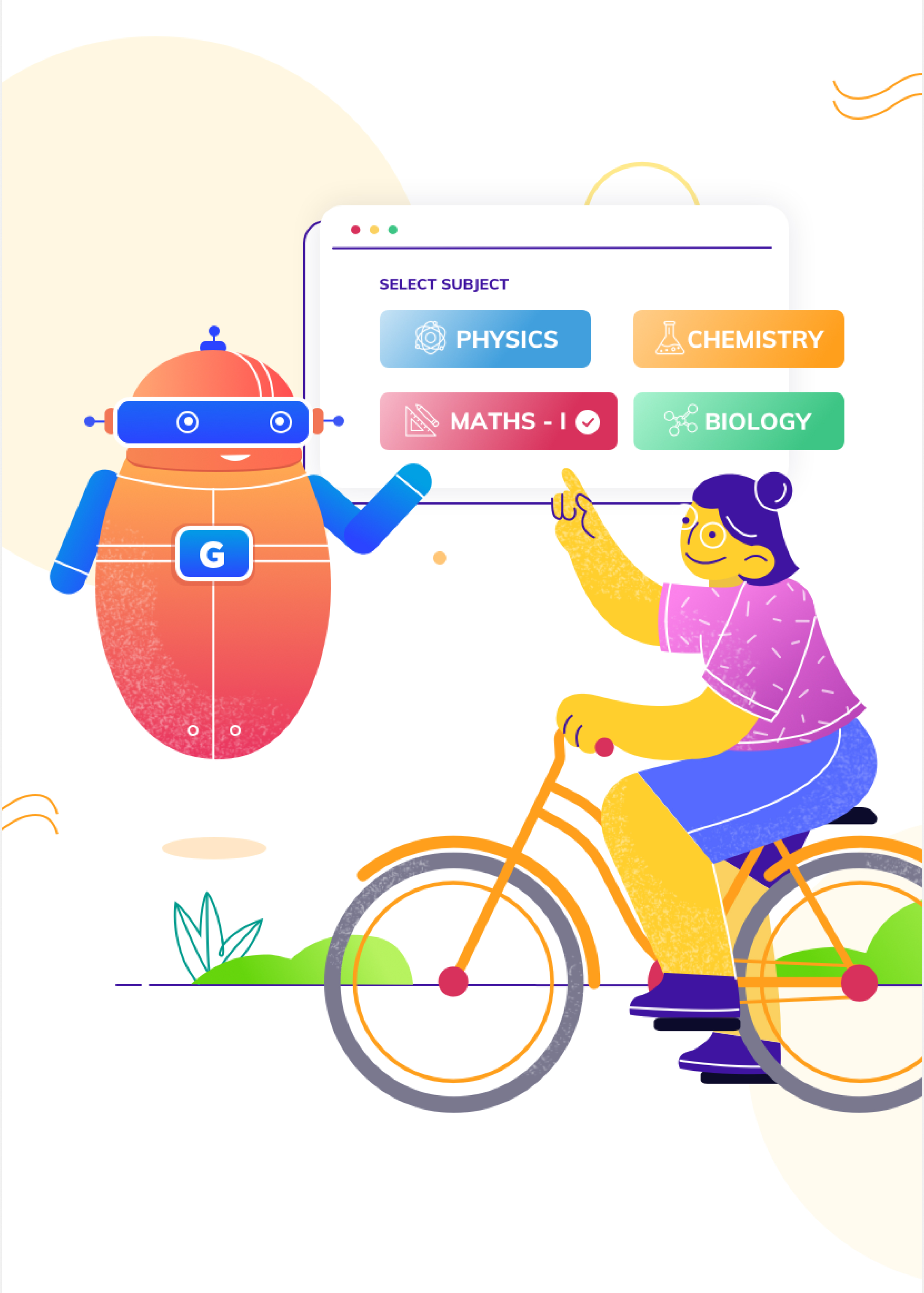
- Introduced a robot guide character to humanize the experience
- Used conversational prompts like “How prepared are you?” instead of rigid instructions
- Created a sense of journey instead of evaluation

Visual-First UI System
- The UI approach was rooted in making test preparation feel less intimidating and more engaging for students. Instead of a conventional, rigid academic interface, the experience was designed to feel guided, supportive, and interactive.
- Conversational microcopy (e.g., “How prepared are you?”)
- Visual cues that reduce cognitive pressure
- Friendly onboarding to build comfort and trust
Structured Information Hierarchy
- Given the content-heavy nature of test preparation, the interface prioritizes clarity and scannability.
- Card-based layouts to break down complex information
- Clear segmentation of flows: onboarding → subject selection → test → results
- Use of progress indicators, timers, and status bars to maintain context
- Primary actions (CTAs) highlighted consistently at the bottom for thumb reach
- This ensures users can navigate quickly without feeling overwhelmed.

Illustration Language
- Developed a playful, vibrant illustration style
- Focused on:
- Learning moments
- Everyday student scenarios
- Light humor & relatability
- Balanced gradients with flat colors for depth without clutter
- Mix of Bright and pastel, energetic palette to reduce anxiety

A fun game was designed internally, to show progress journey timeline for each student in very playful and engaging way, making student less anxious about results and more fun.